ShopDreamUp AI ArtDreamUp
Deviation Actions


Description
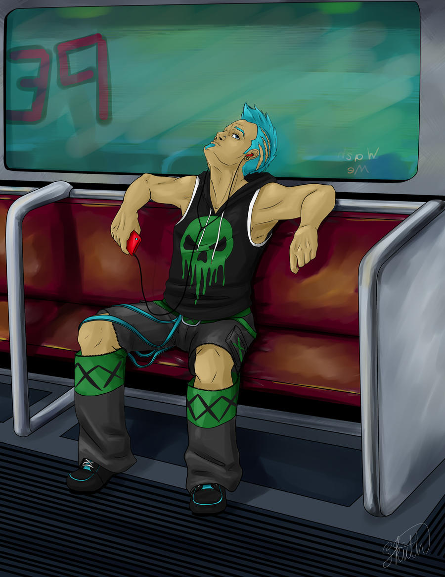
So I was wanting to revisit an old design because I wasn't happy with it. I was also testing out using paint tool sai and using a more painted style to my art instead of a cell shading. I think I'm going to work with this style more often. I'm not completely happy with the lack of realistic details in the background of this picture, but hey, at least I put in a background this time. (I REALLY need to do more backgrounds. >.< )
character: Victor Daughtry copyright mine and
character: Victor Daughtry copyright mine and
Image size
5100x6600px 12.13 MB
© 2017 - 2024 SkiethWebb
Comments2
Join the community to add your comment. Already a deviant? Log In
Okay, so you're concerned about your painting style and your line work. Let me see what I can do for you.
I'll address the linework, first. I think it was a good instinct of yours to show me the other piece (Ida Lee Valboa WIP) as an example. Although rather light, there's a lot of personality in those lines. I really like the style--the mixture of gossamer details with harder, almost geometric sensibilities. (Of course I would--I draw with a similar principle!) What strikes me about the linework in this piece here is how different it is. It's all right. It services. There's actually nothing wrong with it. I think it lacks a lot of the romance of your other piece, though, and I think I know what might have happened: the other one is traditional. It's very easy to fall in love with the idea of minimalist, squeaky clean lines when we work digitally. Anecdote about this, actually: I recently injured my wrists very badly. (No story--just overuse.) So, I'm unable to do lines as cleanly as I used to, and it's been very educational for me. Breaking away from the allure of clean lines has given my work a lot more personality. I'm not saying that clean lines are a bad thing... just something to consider when trying to craft your style.
Now, the painting. Here are my observations. Looking at the environment, there are a lot of visible strokes. In addition to this, there is also some color variation in areas that displays that you have some knowledge of color theory and scattered light that you're experimenting with. The painting could be tightened up in places, but that's something you can work on. Now, the painting in the figure is very different. It's much cleaner, tighter. Here's the part that may surprise you, though: the 'messier' painting in the environment is more visually engaging. The other thing I notice is that all of your shading on the figure is done in darker shades of the base hue. The color experimentation is absent here. The impression I get, looking at it, is that you may be a little bit afraid of coloring people! That may not be the kind of impression you want to give.
Long story short, here is my advice:
1. Try working digitally in a lineart style that's more similar to the way you work traditionally. Don't be afraid of 'sketching' the lines. You may like the result.
2. Find a way of working your strokes that's maybe something between the loose strokes in your environment and the clean ones on your figure. After you find something that works, don't stop experimenting!
3. Experiment more with color, especially when coloring your figures. Try using different hues in your shadows and highlights.
Side note: I like the updates you did to this character's design. It's a much more matured handling, I think, and you have a good eye for color distribution.